Visualisation#
popkinmocks cube objects have three methods for visualisation. These are lightweight wrappers around matplotlib methods. To demonstrate this, let’s create an example component:
import numpy as np
import matplotlib.pyplot as plt
import popkinmocks as pkm

ssps = pkm.milesSSPs(lmd_min=5850, lmd_max=5950)
cube = pkm.ifu_cube.IFUCube(ssps=ssps, nx1=20, nx2=20, nv=21)
stream = pkm.components.Stream(cube=cube)
stream.set_p_t(lmd=5., phi=0.3)
stream.set_sig_v()
stream.set_t_dep(10.)
stream.set_p_x_t()
stream.set_mu_v()
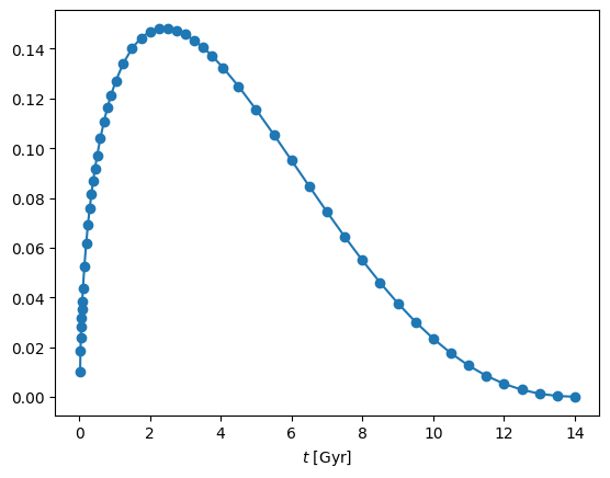
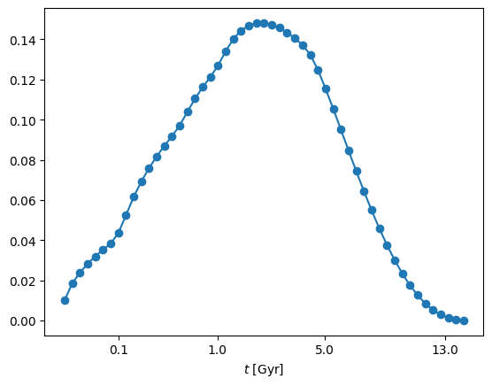
cube.plot#
This method is a wrapper around matplotlib.pyplot.plot. You provide the x-axis variable as a string (any of t, v, x1, x2 or z) along with the associated y-axis data:
sfh = stream.get_p('t')
_ = cube.plot('t', sfh, '-o')
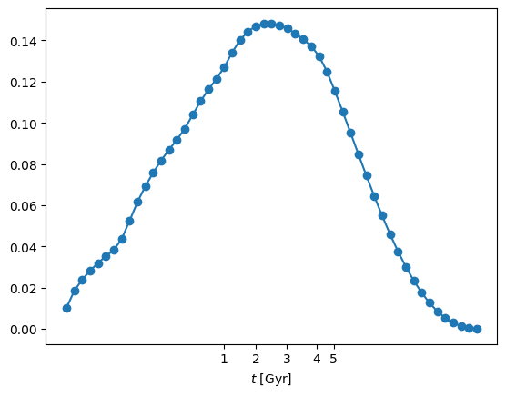
The wrapper inserts the the appropriate x-axis labels and values in physical units. Another option is to use an x-axis spacing which highlights the discretisation of the SSP models,
_ = cube.plot('t', sfh, '-o', xspacing='discrete')
In this case the wrapper adjusts the x-axis ticks to the correct positions. If you chose this xspacing='discrete' option, you can adjust the position of the ticks as follows:
cube.ssps.set_tick_positions(t_ticks=[1, 2, 3, 4, 5])
_ = cube.plot('t', sfh, '-o', xspacing='discrete')
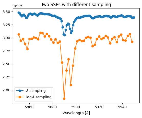
cube.plot_spectrum#
This is another wrapper around matplotlib.pyplot.plot but specifically for plotting spectra. This only takes a single argument: the y-axis data. In addition to axis labelling, this wrapper determines whether the data are sampled in wavelength or log-wavelength. It can be used in both cases:
t1, z1, spec1 = ssps.get_ssp(103, spacing='wavelength')
t2, z2, spec2 = ssps.get_ssp(463, spacing='log-wavelength')
print(f'spec1 is sampled in wavelength and has shape {spec1.shape}')
print(f'spec2 is sampled in log-wavelength and has shape {spec2.shape}')

cube.plot_spectrum(spec1, '-o', label='$\lambda$ sampling')
cube.plot_spectrum(spec2, '-o', label='$\log \lambda$ sampling')
plt.gca().legend()
_ = plt.gca().set_title('Two SSPs with different sampling')
spec1 is sampled in wavelength and has shape (111,)
spec2 is sampled in log-wavelength and has shape (53,)
cube.imshow#
This is a wrapper around matplotlib.pyplot.imshow which can be used to plot 2D images. These can be on-sky images, e.g.
p_x = stream.get_p('x')
_ = cube.imshow(p_x, interpolation='gaussian')
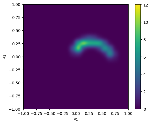
Note
You can pass keyword arguments to the matplotlib routines e.g. interpolation='gaussian' in the above example is passed to matplotlib.pyplot.imshow
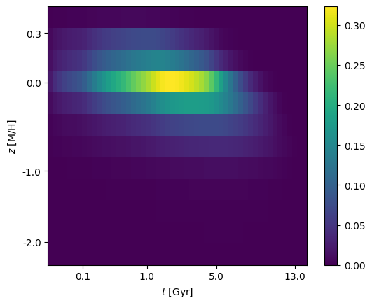
On-sky images are the default view offered by cube.imshow but any 2D combination of variables is possible. These are specified as a pair of strings (amongst t, v, x1, x2 or z) corresponding to the \((x,y)\) axis of the image e.g. to plot the age-metallicity distribution:
p_tz = stream.get_p('tz')
_ = cube.imshow(p_tz, view=['t', 'z'])
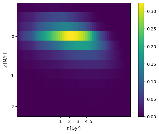
This wrapper can only display images where equal-sized pixels correspond to the discretisation of the SSP grid (i.e. not physical units). As before you can control the tickmarks using
cube.ssps.set_tick_positions(
  z_ticks=[-2, -1, 0, 0.3],
  t_ticks=[0.1, 1, 5, 13]
  )
_ = cube.imshow(p_tz, view=['t', 'z'])